It’s a random visit to my retired mother relaxing in the Xian’nv Mountain, Chongqing. I launched a tour with my wife to a nearby scenic spot named Lanba, which was just several kilometers away from her residence. Although our purpose was just walking around and killing time, we had a wonderful experience there with gorgeous natural scenery and excellent architecture.
Natural scenery images
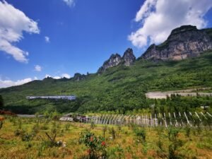
We were shocked by the spectacular scenery when we arrived at this spot. The location was embedded in a relatively high mountainous place, and we could see the steep peak, back against which we got a wide-spread view scope enjoying layers of far-away mountains.

A few buildings were scattered in this area, including an art gallery, a pavilion, a Buddhist temple, etc. Lanes connected them, and the host provided sightseeing vehicles to get to every spot.
Located at about 1300 meters, this site gained a picturesque landscape containing a terrace, slope, and grass forest against mountains as the background. In the warm daylight, the scenery brought us peace and pleasure.
Design Gallery
As an architect, I undoubtedly was interested in these buildings sited in such a great landscape. And I was pretty sure the designers must take the views into account, and aim to melt their works into it.
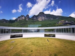
My predictions were proved true in a gallery, which was set with an ellipse layout. Built on a hilltop, this gallery had two layers. The architect chose a belt about 10 meters wide to organize the gallery’s volume, which looked simple but efficient. The belt enclosed and divided the space into two parts, the outer landscape and the inner courtyard.
He reserved several sight lanes between the two parts, encouraging me to explore the connection of both sides. I indeed found an architectural frame that enclosed the outer natural landscape, forming a fantasy hanging wall painting.

Modern languages building
As claimed above, the architectural volume was simple in a geometrical ellipse, which was contrary to the irregular natural landscape outlines. This was a dramatic and elegant idea to combine natural and artificial environments, a successful adventure to explain Lanba’s natural features architecturally.
Deriving from the simplification of the total architectural conception, modern languages were applied to every detail of this building, and geometric elements could be used everywhere. The first layer was made of adobe and designed to look solid, the vacuum facade remained in low proportion, while the upper layer was wrapped with curtain glasses, which looked smooth and unrealistic.

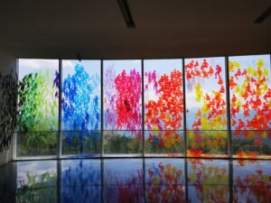
Interior design of the art gallery
The belt shape forced the inner space to be organized linearly, corresponding to the exhibition routine. Therefore, all spaces and rooms were aligned one by one, and the main passage extended following the ellipse.

Exhibition walls, showcases, and exhibition brackets were the secondary dividing elements that defined spaces. Like most galleries, they are set up decently to set off exhibits.
Modern landscape architecture
As I claimed in another article ‘Ancient Architecture Tour Inspiring Black Myth: Wukong’, buildings and enclosure spaces have equal importance in Chinese architects’ eyes. We design buildings and are interested in making the courtyard elegant, that’s what you can find in I.M. Pei’s Suzhou Museum.
This gallery’s architect outlined the courtyard along the building’s wall, on a smaller scale. For setting off the main role of the gallery, he handled the yard restrainedly with grasses. Taking a photo at the point of the grass’ edge, I got a beautiful image filled with several expanding curves, which contains the line of the blue sky, the curtain glasses, and the green grass.

In this image, I clearly understood the integration of landscape and architecture.
It was an amazing short trip for me, and I got an excellent case study there. I am eager to apply these thoughts to my upcoming projects.


